Matching Grout Colors: A Simple Way To Enhance Your Backsplash Tile Style
June 27, 2024
You found the perfect backsplash tile! That's fantastic! Now, it’s time for the next big choice: the grout color. This decision is just as important as selecting your tile. Why’s that? Because grout plays a key role in how your backsplash will look once it’s installed. A contrasting grout color can create an eye-catching pattern. On the other hand, a grout color that matches your tile can subtly highlight the beauty of the tile instead of the grout lines. Get ready to make a bold choice!
Looking to spruce up your room? Here are popular grout styles to consider! They're sure to brighten your space and make it feel fresh. Let's dive in and find the perfect match for your needs!
Match Grout to Tile
Want your backsplash tile to shine? Choose a grout color that perfectly matches your tile! This trick keeps all the attention on the beautiful tile itself. It's especially effective with neutral tiles like whites, creams, and grays. These colors create a calm and serene backdrop. In the kitchen above, the Morning Fog tile features soft gray. Paired with color-matched grout, it delivers a chic and understated look. Enjoy your stunning backsplash!
Go Light
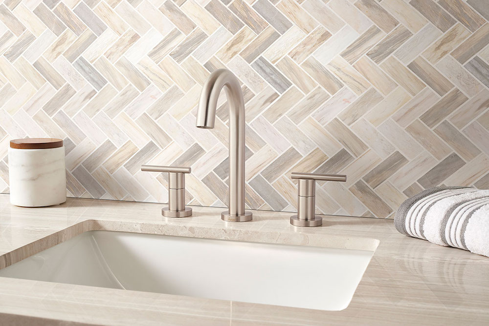 Angora Polished Herringbone Tile
Going light with grout is a popular choice. It’s a safe bet, especially with colorful mosaic tiles! This contrast makes unique tile shapes and colors pop in a fresh way. Here’s a tip: for a balanced kitchen backsplash, choose warm white grout for cool-toned tiles. Use cool, bright white grout for warm-toned tiles. In the photos above, off-white grout beautifully outlines our Angora Polished Herringbone tile. It creates a fresh, contemporary look that feels soft and inviting!
Go Dark
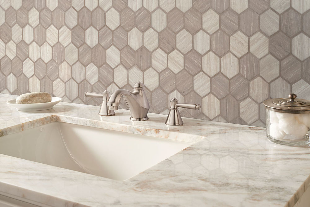 Silva Oak 2" Hexagon Mosaic Tile
Looking for a fun twist? Try using a dark grout! It's perfect if you want to showcase unique backsplash tile shapes, like the offset brick pattern with our Silva Oak Hexagon tiles. The grout doesn’t need to be super dark either. You can choose taupes, beiges, or mochas as darker options. They can add a subtly dramatic touch to neutral mosaics. Plus, the best part? Darker grout doesn’t show stains as quickly as lighter colors. Enjoy your stylish upgrade!
Match Grout to Other Details in a Room
Don't forget to look beyond your backsplash! Consider other colors in the room, like wall paint or a stunning countertop. These can help you create a cohesive design for your kitchen or bathroom. In the photo above, the taupe-hued grout around our Athena Gold tiles beautifully matches the countertop. It's a great way to tie everything together!
If you’re torn between your favorite choices, here’s a fun idea! Create mockup samples of your tile and potential grout designs on a piece of wood. Place it in the room you’re remodeling. Picture what those designs would look like as wall tile in the morning, during the day, and at night. After a week, you'll start to sense which grout color feels just right for you.
And for extra inspiration, don’t miss our Backsplash Tile Guide! For personalized advice or to see the wide range of MSI backsplsh tile options available, chat online with an MSI expert, visit a nearby MSI showroom, or find a local authorized MSI retailer near you. Your dream tiles backsplash is just a step away!
READ MORE ABOUT BACKSPLASH TILE
Revamp Your Room Using Arabesque Backsplash Tile
Unique DIY Mosaic Tile Projects for Your Kitchen Backsplash
MSI’s Highland Park Backsplash Tile Collection
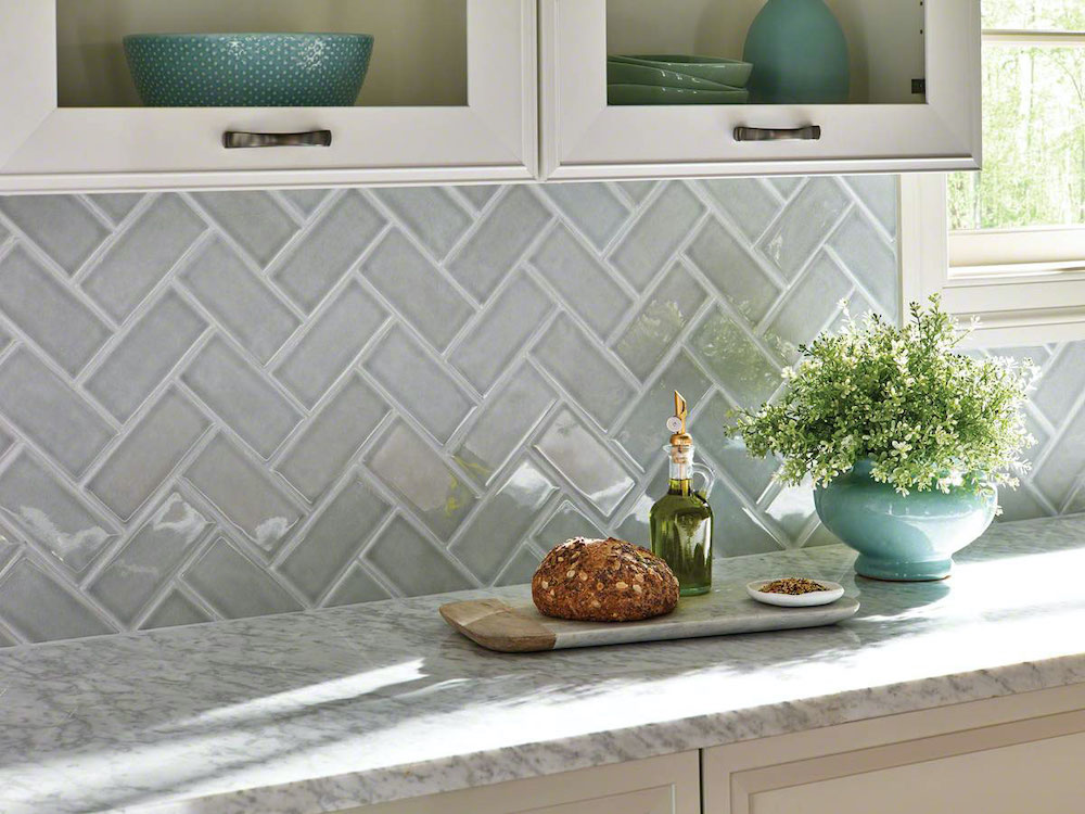 Morning Fog Subway Tile 3x6
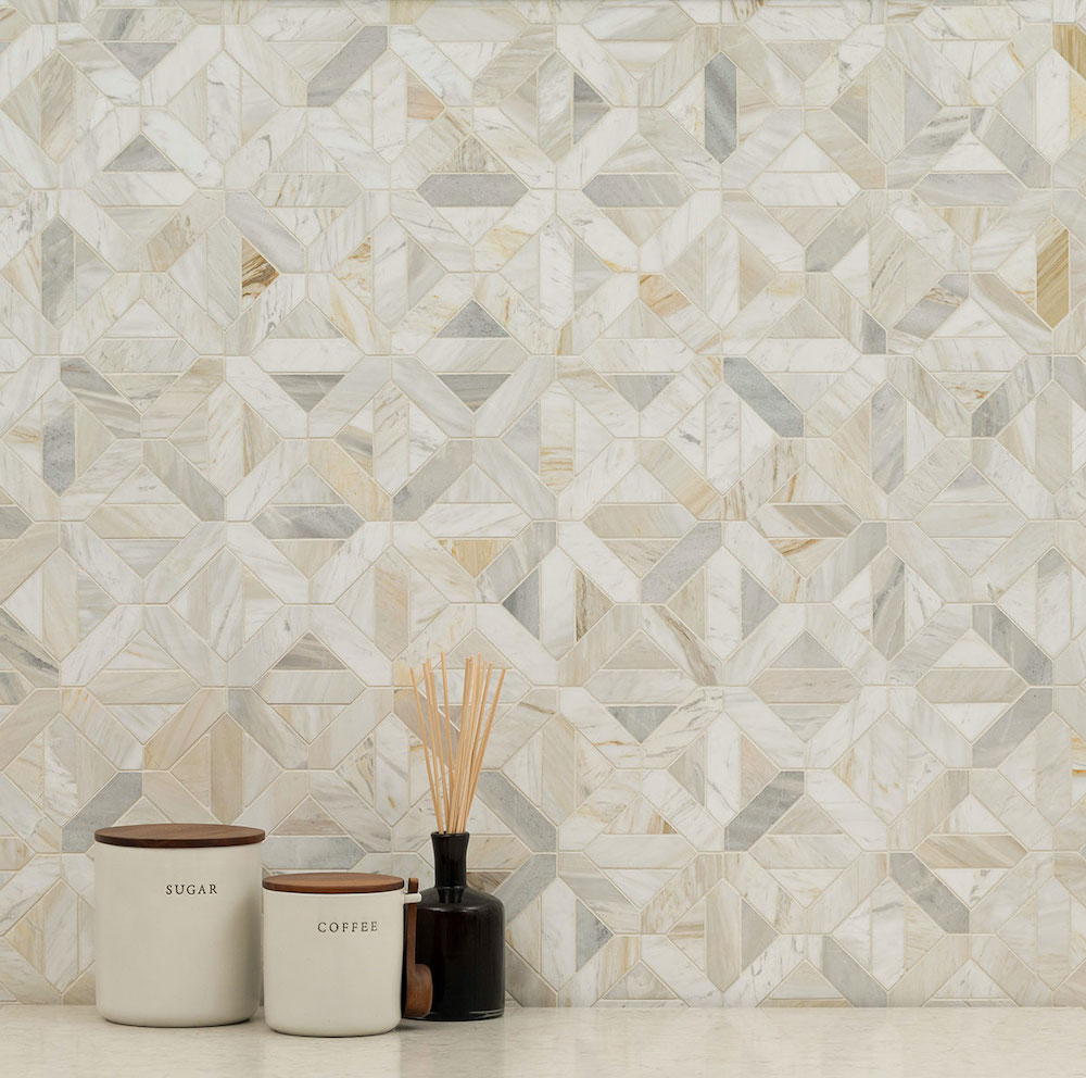 Athena Gold Geometrica Honed