Tile 101: Choosing The Right Grout For Your Tile
June 05, 2015[Revised February 2025 – updated content and current products added]
Grout is not just the glue that holds your tile flooring together. It's an essential part of your design! Often overlooked, choosing the right grout is just as important as picking your tiles. It can truly make a difference in how much you love the final result.
Grout options have expanded significantly over the years. Today, you can find grout in nearly every color of the rainbow! Whether you want it to blend in or stand out, the right color can transform your tiles. Just by changing the grout color, you can shift your look from classic and traditional to modern and sleek!
Blended Perfection
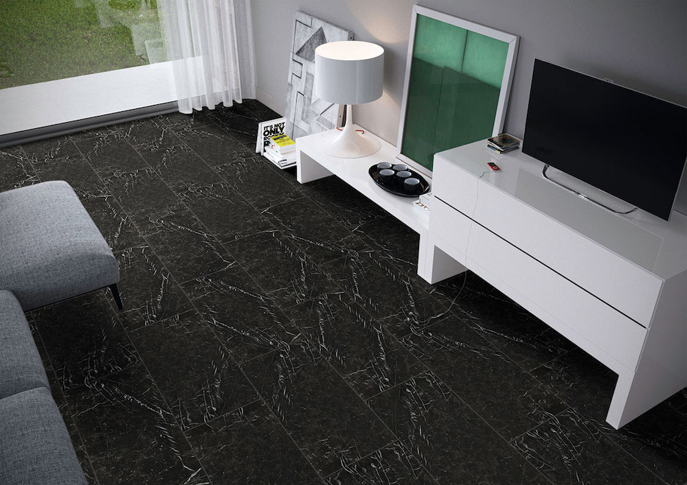 Marquina Noir Porcelain Tile
Choosing grout that matches your tile's base color can be a game-changer! It really lets the beauty of the tile shine. When the grout complements the tile, the amazing colors, patterns, and veining of marble, travertine, or porcelain tiles pop beautifully. Your tile will be the star!
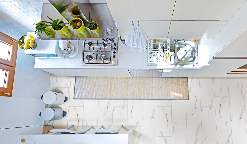
Using the right tiles can also make a small space feel larger! A subtle installation pattern lets the tile flooring take center stage. This creates a stylish and inviting atmosphere.
For marble or marble-look porcelain tiles, matching the grout color to the tile's base is a fantastic choice! This combination offers a classic look while showcasing the stunning variations and veins in the marble. Enjoy all that elegance!
 Aria Bianco Porcelain Tile
When tiles are paired with grout that matches their veining, the result is stunning! The installation pattern becomes more prominent while still being subtle. This creates a classic, old-world charm that enhances the entire room. It's a beautiful transformation!
Creative Contrast
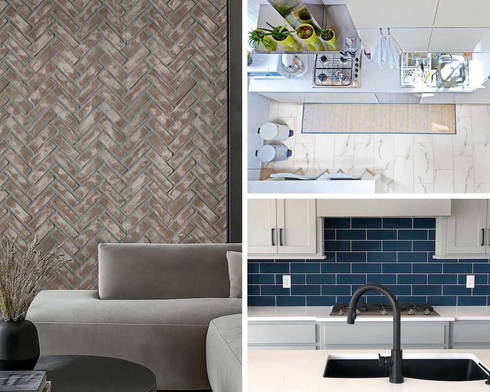
Contrasting grout can really make your installation pop! It doesn't have to be visually jarring at all. In the kitchen below, light grout pairs perfectly with darker tiles. The result? It beautifully highlights the colors in the natural stone countertops and backsplashes. The look is cohesive and stunning!
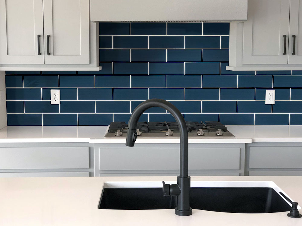 Midnight Glass Subway Tile
For a modern kitchen backsplash, classic subway tiles with white grout offer a sleek, minimalist look that never goes out of style. This clean and simple design keeps the space feeling fresh and open. Want to add a bold touch? Opt for dark gray grout to create contrast and make the tile pattern pop. This subtle yet striking detail adds depth and dimension, giving your kitchen a contemporary edge while maintaining its timeless appeal. Try the same strategy with herringbone backsplash tile.
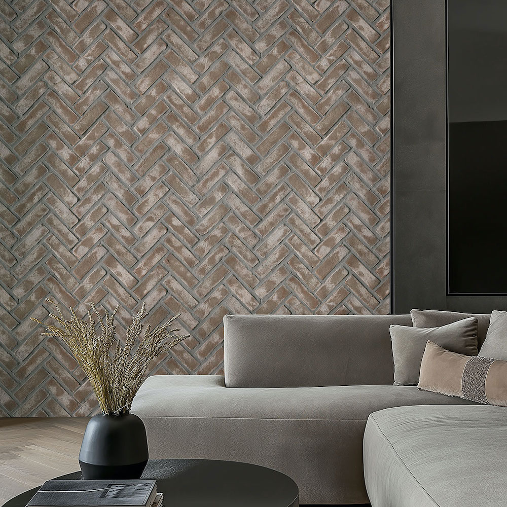 Doverton Gray Reclaimed Clay Brick Herringbone
Since the contrasting grout, whether darker or lighter, is going to bring the design pattern more into focus, consider a chevron, herringbone, or vertical offset pattern for additional visual interest.
Choosing the right grout is an exciting part of your project! It’s not just about color or contrast. Pay attention to the type of grout you select. The two most common types are sanded and non-sanded. Sanded grouts are budget-friendly, but they can scratch some tiles, like glass and marble. So, be careful! They work great for porcelain, though. Non-sanded grouts are a little pricier, but don’t let that be your only consideration. Team up with your installer to find the perfect grout for your project. Happy decorating!
Quick Tips for Choosing Grout
- Test Before Committing: Apply tile and different grout colors to a plywood sample, let it cure, and place it in the room to see how lighting affects the look. Natural, incandescent, fluorescent, and LED lighting can all change the grout’s appearance.
- Be Patient: Colored grout can take days or even weeks to fully cure, so allow time before making a final decision.
- Seal Light Grout: White and light-colored grouts should be sealed, especially in high-traffic areas and showers, to prevent staining.
- Consider Dark Grout: Darker grouts hide dirt and stains better but may fade with prolonged sun exposure.
- Seal for Protection: Sealing grout preserves color while also preventing mold and mildew buildup.
- Keep Extra Grout: Save some unmixed grout from installation for future touch-ups or repairs.
Grout selection plays a crucial role in your design. As you finalize your tile choices, explore the wide range of grout colors available. Consider these key questions: Do you want the tile to be the focal point, or should the pattern take center stage? Are you aiming for a seamless look or a more defined, linear effect? The right grout can enhance your design and bring your vision to life.
Looking for "tile flooring near me"? Chat online with our friendly experts! Visit an MSI showroom today or find a local authorized MSI retailer. You can explore a fantastic range of flooring options up close. Let’s start transforming your space now!
Learn More About Tile Flooring:
Best Tile Flooring for a Welcoming Entryway
Unique Designs for Mosaic Tile Flooring
Exploring MSI's Collection of Porcelain Wood Look Tile Flooring