The Best Uses For Granite Countertops
September 30, 2020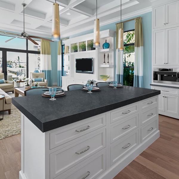
Granite countertops have become the “gold standard” in high-end, luxury kitchens and baths. They’re usually the choice for magazine spreads, model homes, and more. There’s a good reason for this — several good reasons, actually. Designers that choose to install granite countertops are as sensible and wise as they are creative.
Durability is a major consideration when choosing a countertop, and granite leads the pack. It’s an extremely hard material, and since it resists damage so well, it may very well be the last countertop you’ll need to install in your home. The kitchen is often the busiest room in the house, used for much more than meal preparation, so homeowners appreciate not having to constantly worry about scratches, stains, or other damage. Here’s what makes granite a durable choice:
- Resists scratching: We don’t recommend using your granite countertop as a cutting board, but if you did, there’s a good chance it would still look like new. Therefore, you know it can stand up to anything your kids can dish out, from homework to art projects and playtime.
- Resists staining: When properly sealed, granite is virtually non-porous. If it doesn’t absorb liquid, stains won’t be a problem. Even if you own a white granite countertop, you won’t have to worry about common stain-causing foods like spaghetti sauce, red wine, or coffee and tea.
- Withstands heat: Even the most cautious cooks will slip up occasionally and forget to put a hot pan on a protective pad or trivet. Although it’s still best to avoid direct contact between hot items and the countertop, granite stands up to such abuse beautifully without discoloration or other damage. Also, you need not worry about the granite countertop next to a cooktop or outdoor grill.
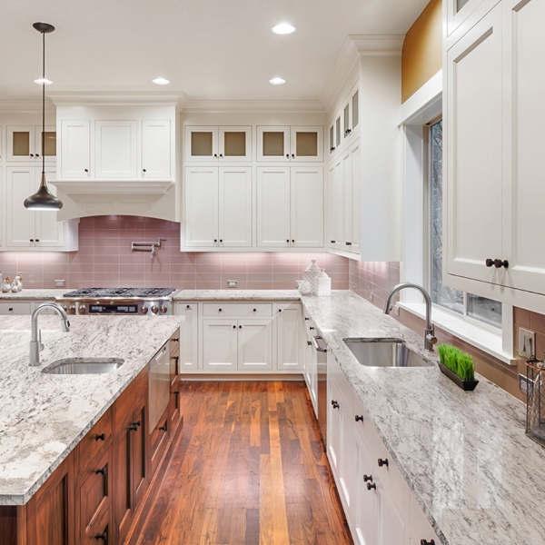
If your granite countertop ever does become damaged, it will be relatively easy to repair instead of replacing the whole thing. Minor chips, scratches, and cracks can be repaired as a DIY project using a specialized epoxy manufactured for this purpose; these are sold separately or in granite repair kits. If the damage is more extensive, or you don’t trust your own abilities, you can hire a professional to do the job, and your counter will be restored to its original beauty. Also, if after many years of use your granite loses its luster, a pro can refinish it and re-seal it so it looks like the day it was first installed. Granite is a timeless material, adapting to any style of décor and lending itself to a variety of applications. Here are a few examples:
.jpg)
Granite is ideal for use in the bathroom because it’s easy to maintain and keep hygienic. It is resistant to stains from water, minerals, and personal care products. Daily cleaning simply requires a soft cloth and diluted dish soap. More stubborn stains can be removed using commercial cleansers, but you’ll need to avoid products that are acidic or contain bleach.
The key to keeping granite’s resistance to stains, bacteria, mold, and other nasty things is proper sealing. All natural stone requires periodic sealing to maintain its non-porous quality. A granite countertop or backsplash will need sealing once a year. Yours may need it more or less often, depending on the type of granite or sealer. You can easily check this by placing a small amount of water on the counter surface to see if it is absorbed. If it is, you need to seal. Fortunately, applying sealer is not a difficult process, and well worth the effort.
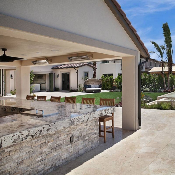
Granite is an ideal choice for outdoor applications, too. If you’re planning an outdoor kitchen or bar area, you may be searching for a countertop material that can withstand the elements such as hot, direct sunlight or freezing temperatures. Granite countertops are resistant to warping and cracking. The only caveat is that we do not recommend black granite for surfaces under direct sunlight. Your countertop will remain beautiful for entertaining for decades.
Having a beautiful kitchen is important, but there are homeowners who plan to use their kitchens for more than a Pinterest photo. Granite countertops are the right choice for busy kitchens. They stand up to the challenges of meal prep, kids’ projects, and family gatherings. Easy cleaning means the kitchen is always spotless and ready for company.
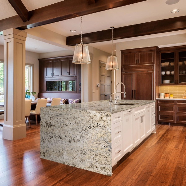
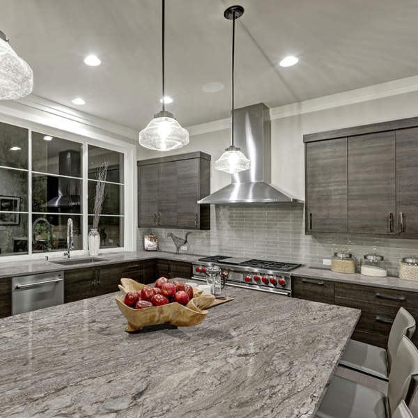
There’s no question about granite countertops’ beauty. Granite has depth you can’t find in any man-made lookalike, a consideration in comparing quartz vs. granite. Although many people think granite is only for traditional-style homes, one of the best uses for granite is to give your home a modern update — try a contemporary waterfall edge in our granite visualizer to see for yourself.
What’s more, homeowners who want a kitchen or bath beyond the ordinary often choose natural stone because of its uniqueness; no two pieces are exactly the same. In fact, you may even want to go to the slab yard and select the exact granite piece you want for your home. Patterns range from subtle to bold, with lots of movement, really showcasing the one-of-a-kind nature of granite countertops.
Like granite, marble kitchens are always in style and are luxury high-end countertop materials. Not every homeowner wants to deal with the maintenance marble needs, though. Although it’s also a natural stone, granite is a lot easier to care for, and can mimic the look of marble quite well.
All of these characteristics add up to one thing: Granite countertops increase your home’s value. Naturally, you’re going to enjoy your countertops for many years — but if you do plan to sell your home, prospective home buyers will be impressed by the elegance and timeless quality of your countertops.
The durability, the easy care, the versatility, and the beauty of a natural granite countertop are just a few reasons for making the choice. It’s one of the best investments you can make in improving your home, one that will pay off in so many ways.
Read More about Granite Countertops
Granite Countertops: Passing Fad or Timeless Investment?
How to Keep Your Granite Countertops Looking Their Best
Natural Granite Countertops Frequently Asked Questions
Black Granite Countertops Make a Powerful Statement
READ MORE ABOUT GRANITE COUNTERTOPS
Solve Your Color Scheme Dilemma with Salt And Pepper Granite Countertops
Striking Black Granite Countertops You Must See