Why Do Surfaces Look Different In Photos Than In Person?
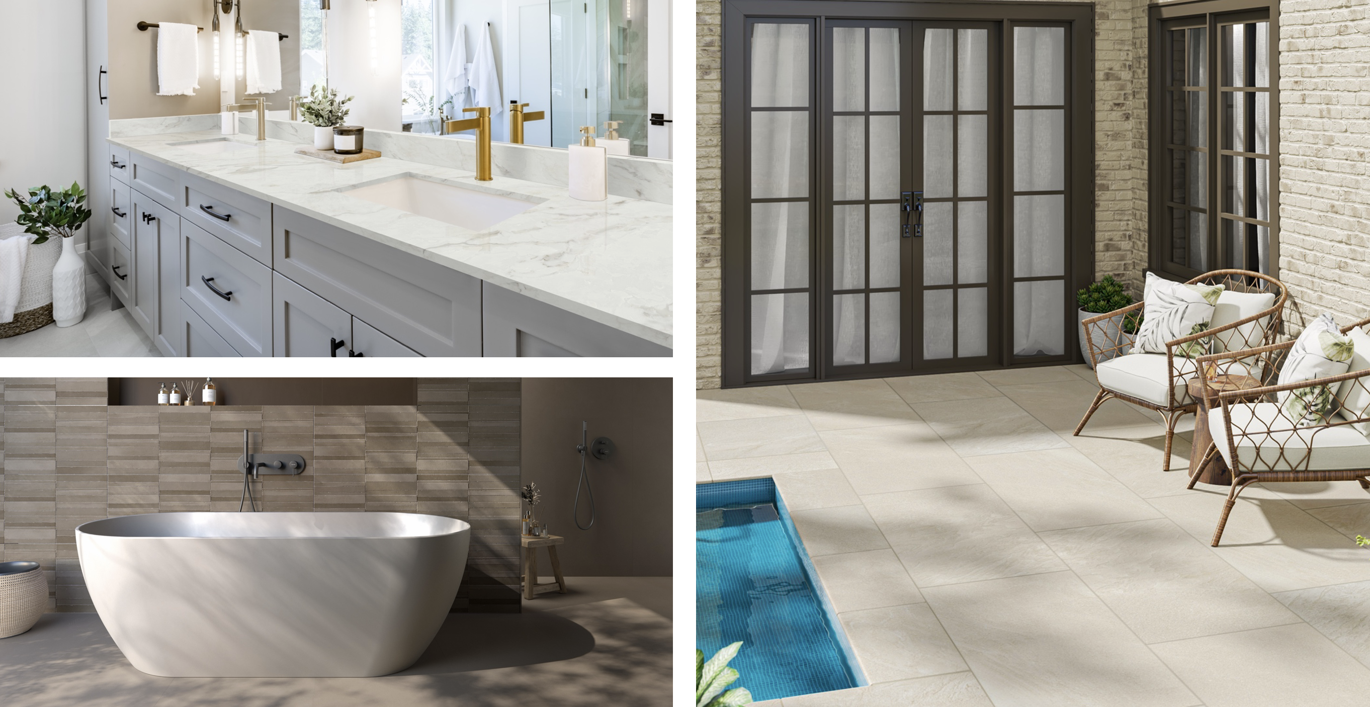
Weeks of scrolling photographs, comparing swatches on your screen, maybe even walking a store floor to make your pick. Then the countertop, tile or paver is installed, and something is wrong. The stone feels warmer than you remember. The tile is a little lighter than the sample. Do you ever find yourself wondering, “why does my countertop look different than the photo?”
This is not a product issue. It is a perception and environment problem, and it becomes evident in the same way across natural stone, engineered stone, tile and outdoor pavers. Almost always there are five elements responsible for the change: lighting, camera settings, screen calibration, viewing angle and surrounds, and natural material variance. Understanding how each one works makes the divide between the showroom and the home stop feeling like such a mystery.
The Quick Answer
To summarize: lighting, camera settings, screen calibration, viewing angle, natural variation in material all influence the way a surface reads, and none of them suggest anything is wrong with the product. A showroom has different light than your kitchen, a camera sees color differently than your eye, and no two screens display the same image exactly the same way. Add to that the natural variety built into stone, tile and pavers, and it’s typical for a surface to look very different in your home than it did in a photo or on a showroom slab. It is inevitable, not a flaw or deception.
5 Factors That Determine the Appearance of a Surface
Here’s the real story behind each of those five criteria, starting with the one with the biggest impact: lighting affects countertop color more than practically anything else in the space.
1. Lighting Conditions
Natural sunshine is not homogeneous. The light in the morning is cooler and bluer. The light in the afternoon is warmer and golden. The most color-accurate light of the day is on gloomy days. Showrooms and photo studios are designed around daylight-balanced lights, usually between 5000K and 6000K, which is why surfaces look so sharp and true to color when photographed there. Most households opt for warm white bulbs in the range of 2,700K-3,000K, which lends cream and gold undertones to everything in the room from the counter to the floor.
There's a name for that temperature difference: metamerism, and it's the single most common reason a surface looks different at home than it did in a showroom or a product photo. Orientation of the space matters too: north-facing rooms are cooler and stable, whereas south-facing rooms are warmer and change as the afternoon sun comes in, so the same surface can look different depending on which side the windows face.
2. Camera Settings & Photography
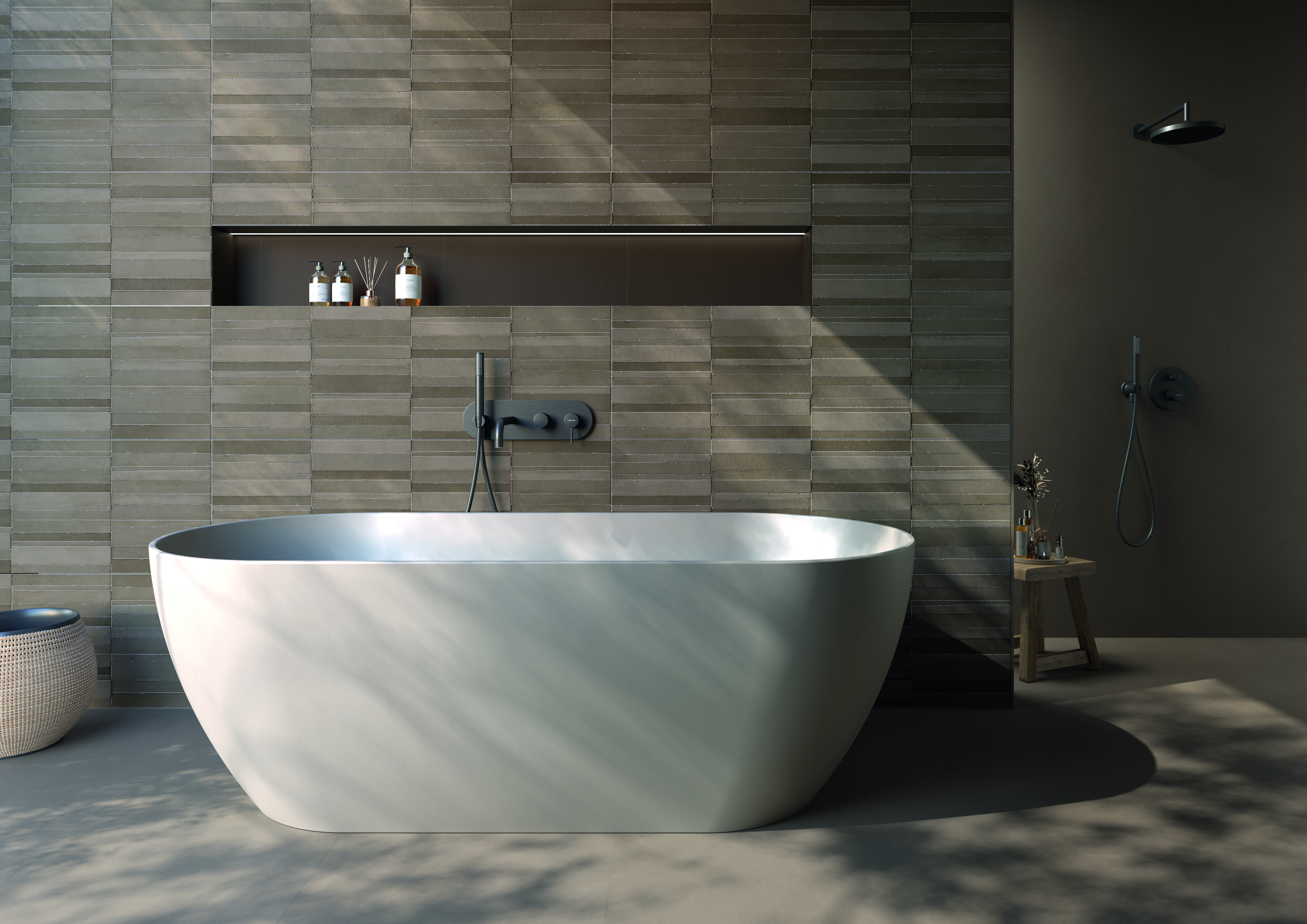
The cameras interpret color. They do not record it like the eye does. If the white balance is set for the light source incorrectly, stone can photograph warmer or cooler than it truly is. Exposure is important as well. Overexposure will flatten the black veining while underexposure will emphasize it. Flash provides flat lighting that kills the shadow and depth that textured or polished things naturally have. Most of the product photographs are likewise close-up hero shots of one idealized slab portion. A full installation reveals the total range of variance that one close-up cannot represent.
3. Screen & Display Calibration
A good shot and well-lit photo can look different depending on what it is viewed on. Mobile screens tend to have more saturated and higher contrast displays than calibrated design monitors, and the difference between the sRGB and P3 color profiles makes the same image look noticeably different from device to device. The brightness adjustments and night mode take the perceived warmth or coldness to the next level. Screen calibration color accuracy is therefore only directional, offering a basic feel for the tone of a surface, and is not a definitive reference for specification or purchase decisions.
4. Field of View, Reflection, Surrounding Environment
Polished finishes function like mirrors, reflecting the colors of their surroundings. The cabinetry, the wall paint, the ceiling color, even what someone is wearing while gazing at it all affect how the surface reads at that time. Honed and matte surfaces disperse the light rather than reflecting it, so they appear more uniform between images and real life. Dark cabinets reflect light to neighboring surfaces and give them a warm cast; white or gray walls give them a cooler tint. A horizontal surface is almost a mirror of its environment. So, what is around it determines what is perceived as much as the material itself.
5. Natural & Manufacturing Variation
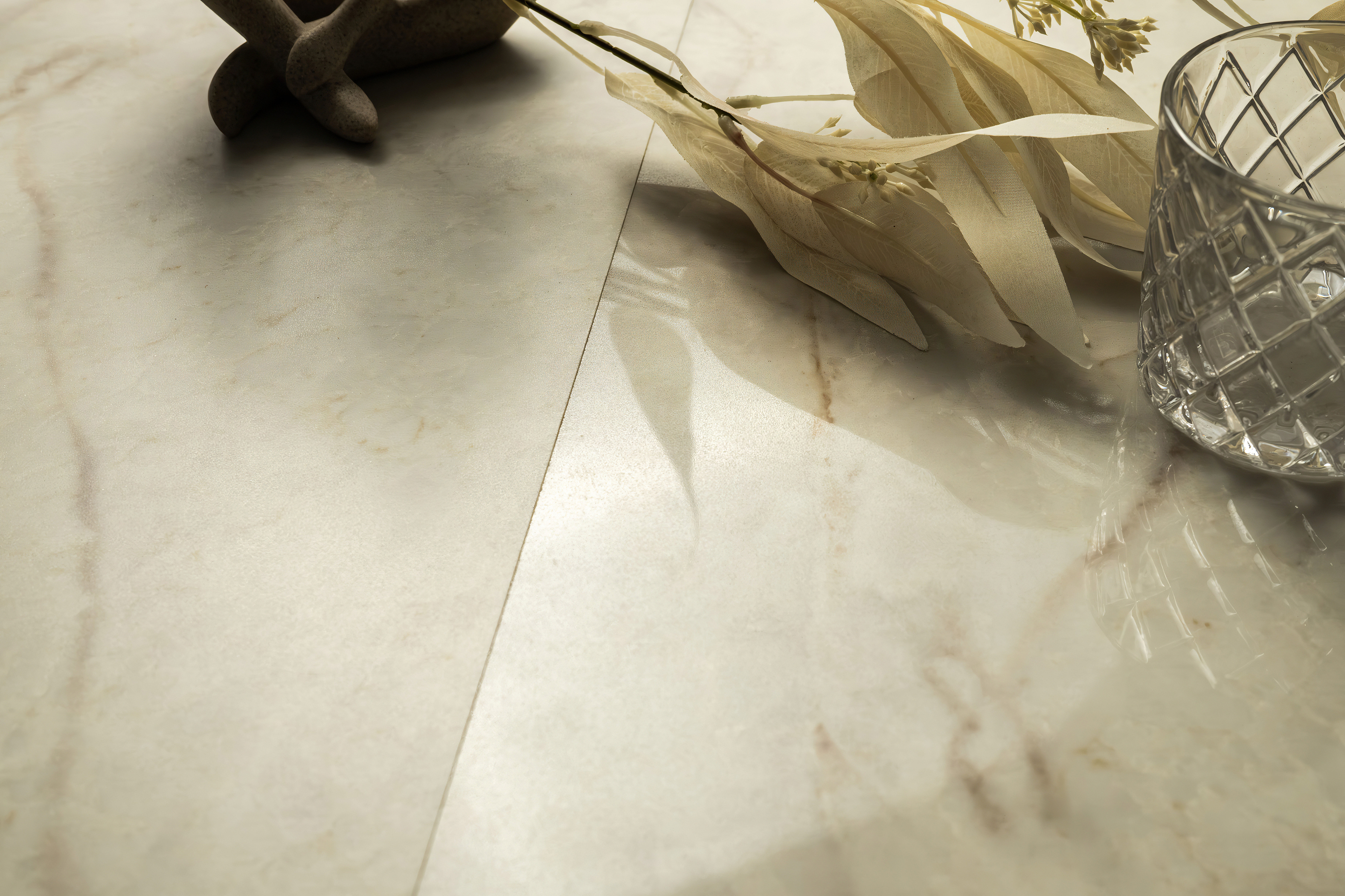
Why do stone colors look different in photos? Natural stone is mined in separate blocks, and each block will have its own mineral composition, veining density, crystal structure and tonal range. No two slabs are exactly alike, not even within the same named product. Engineered stone is manufactured to stricter tolerances, but there is still fluctuation between production runs in manufacturing batch and pigment lot, thus it is not totally uniform either. Tile and pavers may vary somewhat between production batches as well, which is why combining boxes from different lots is typical procedure (not an extra precaution) while installing.
MSI’s natural stone collections are photographed to represent the material family—not a guaranteed match to any individual slab. That diversity is not a defect to be worked around; it’s a natural stone characteristic, and part of what makes each installation feel one of a kind.
What this means for all MSI Surface
The same five criteria play out a bit differently depending on the medium. Here is how natural stone, engineered stone, tile and pavers differ from photo-to-reality hue in an actual MSI installation.
Natural Stone Countertops
Marble, quartzite and travertine each have their own personality variations: dramatic veining in marble, crystalline movement in quartzite and a warm tonal variety in travertine. Two slabs offered under the same color name may look remarkably different from each other in veining density, background tone and mineral movement, which is one reason it is worth studying color variation in natural stone before you commit to a certain slab instead of just a product name.
Engineered Stone Countertops
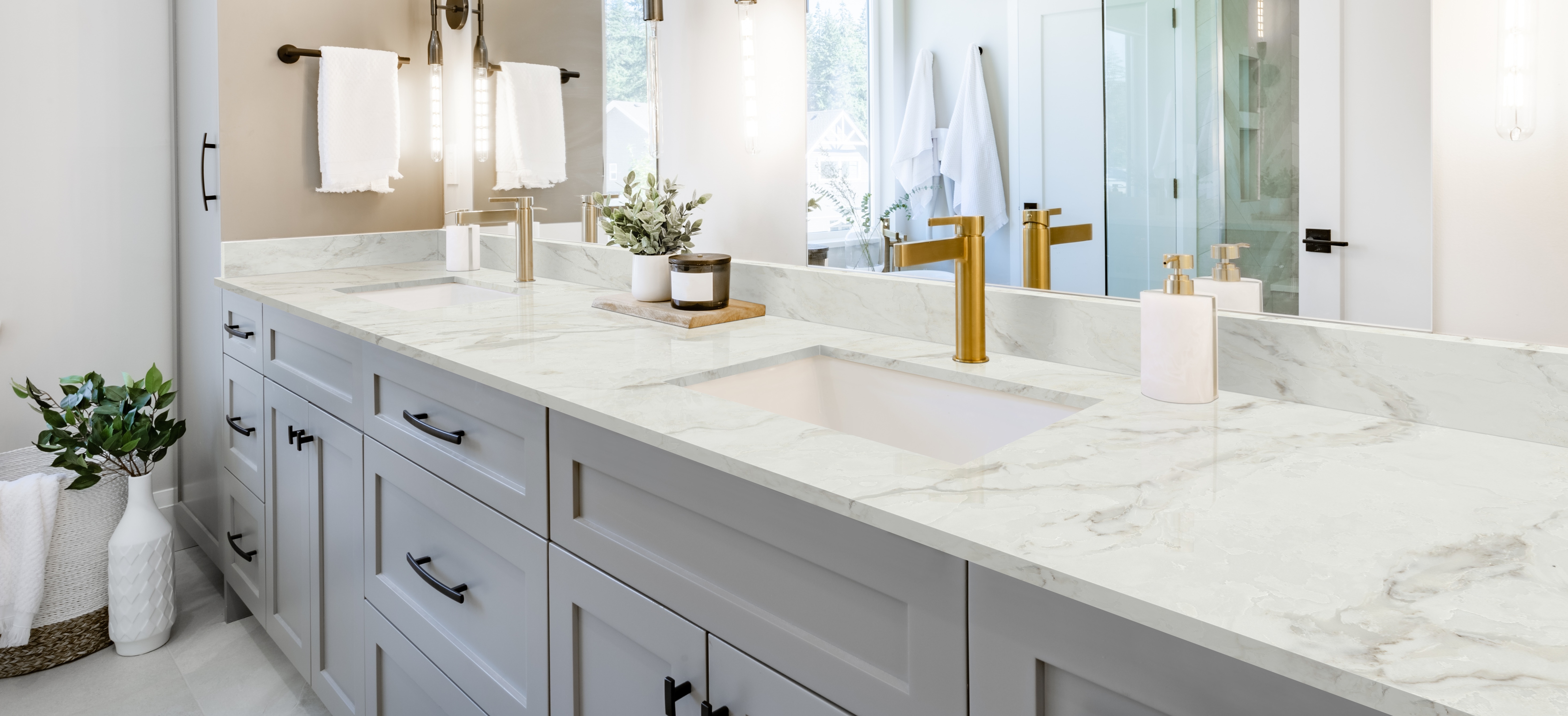
Engineered stone is more uniform than natural stone, but not identical from slab to slab or batch to batch. Light-toned engineered stone often appears creamier in warm residential lighting than it does in product photography taken under daylight-balanced bulbs. Bold veining patterns that look minor in a small stone sample vs full slab can become much more obvious at full countertop scale, and polished engineered stone reflects ambient color and light in ways that a sample simply cannot convey. If you’ve ever googled, why does quartz look different in person, you’re really looking at this same phenomenon in engineered stone. MSI’s Q™ line is produced to be uniform, and lot documentation is available for big commercial projects where color consistency across numerous production cycles is important.
Tile
Due to little color difference from dye lots, it’s best to mix boxes during installation so that the variation is distributed uniformly throughout a floor or wall, instead of concentrated in one spot. Installed tile also looks different once you add grout joints; grout color has a very meaningful impact on how the overall surface tone is read. With directional lighting, textured and relief tiles generate shadow effects that flat product photos cannot. Anyone asking why doesn't my tile match the sample, it’s usually some mix of grout, lighting and dye lot issues.
Arterra Porcelain Pavers & Hardscape
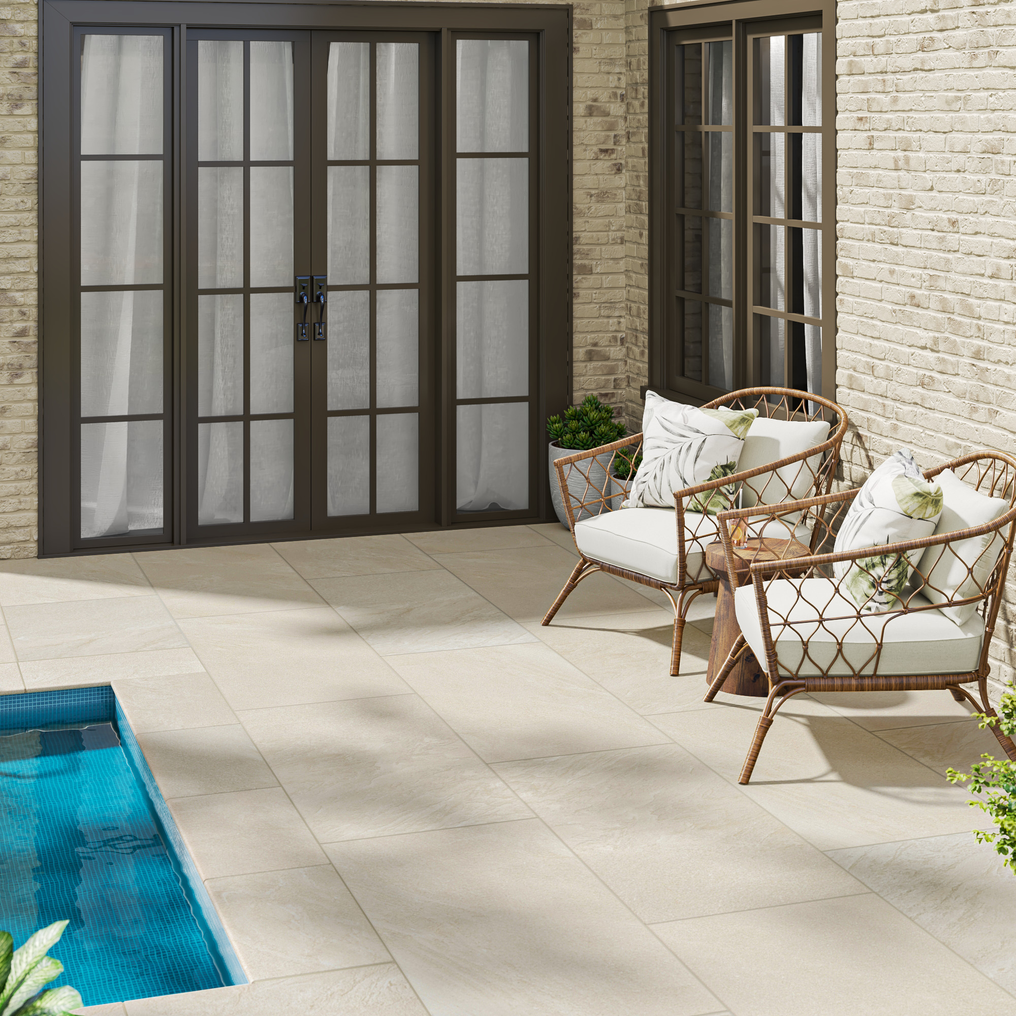
Outdoor materials are subject to issues that product photography cannot properly represent: UV exposure, wet vs. dry surface conditions, the difference between morning shade and afternoon direct sun. The same Arterra paver appears darker and more saturated while wet and lighter and crisper when dry, and both are true to the product. Porcelain paver color variation across a big outdoor installation is to be expected and reads as natural variation rather than inconsistency like natural stone or tile indoors.
Why It Still Matters To See It In Person
Sample vs. Full Slab: The Specification Gap
The sample demonstrates color direction, basic tone and finish character, but not full movement, veining scale or pattern range. Scale alters how the eye sees a design. Veining that looks unobtrusive in a 4-inch sample chip can feel powerful and overpowering across a full island or a floor-to-ceiling backsplash. For countertops and other large-format materials, a full showroom slab is still the most dependable step before specifying. What prevents surprises after installation is understanding natural stone slab variation at that scale, instead of depending on a sample alone.
Setting Client Expectations as Trade Professionals
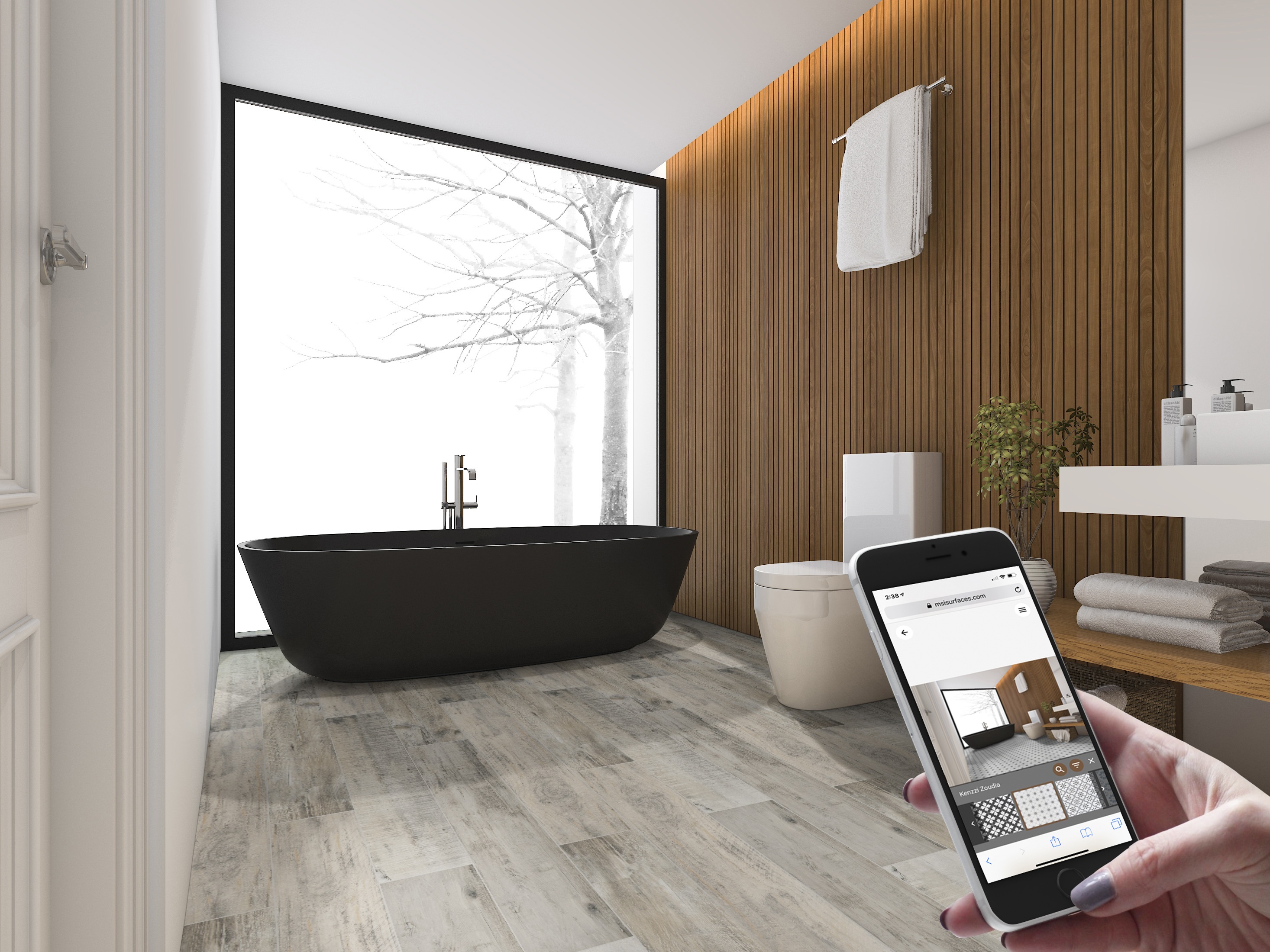
Designers, architects and dealers that show materials to customers using only digital photographs are sometimes unwittingly setting the tone for post-installation surprises. A preferable option is to show at least two images of the same product, one close-up and one complete installation setting, plus a physical sample when possible. It’s worth the extra minute to brief the customer on the lighting gap before sign off, stating a material may most likely look a little warmer or cooler in their unique room depending on their lighting. The MSI surface visualizer is a valuable presentation tool to narrow down possibilities but should be considered a starting point rather than a color guarantee. Most concerns that might otherwise appear after installation are solved in one conversation before specification is finalized.
Two Ways to See the Real Thing
Order a Sample Online
Most product collections are available for MSI sample ordering at msisurfaces.com, and it’s the easiest first step for an accurate read on color. Putting the sample in the real project space, in the real lighting, at more than one time of day; morning, afternoon and evening, will each have a somewhat different narrative to tell. Put it next to every adjacent material in the project: cabinets, flooring, paint, hardware and grout. It’s much more useful to see how a sample interacts with everything around it, rather than in isolation, and it only takes a few minutes to order countertop samples online before committing to the final decision.
Visit Your Local MSI Showroom or Branch
For comprehensive slab viewing, MSI showrooms and authorized dealer locations around the country are the most thorough way to evaluate color, veining scale, finish depth and material weight, none of which can be adequately evaluated by a photo or sample. Taking cabinet doors, flooring samples or paint to compare it with will give you a better feel of how it all looks together. A smart place to start is to look for an MSI showroom near me, as MSI has showrooms and distribution offices all across the country, and most locations don’t require an appointment for product viewing.
Frequently Asked Questions
Q1: Why isn’t my countertop, tile or paver the same as the photo I saw online?
The photo was taken with regulated studio lighting, then edited and exhibited on a screen with its own color settings, three variables that can all change how a material looks. The actual surface will react to the particular lighting of a home, the colors around it and the angle from which it is viewed, and they can be quite different from the shooting setting. They are both right; they are exhibiting the same things in different situations.
Q2: Does Lighting Change the Look of Stone, Engineered Surfaces or Tile?
Yes, significantly. Most picture studios and shops utilize cold daylight balanced light at 5,000K to 6,000K. Most households use warm white bulbs at 2,700K to 3,000K. This temperature difference is known as metamerism and is the most common reason a surface seems different in your house than it did in a showroom or product photo. Warm light brings out cream and gold undertones, cold light gray and white tones.
Q3: Why do two slabs/tiles with the same name look different?
Natural stone is naturally variable. No two quarry blocks are same, with each having its distinct mineral structure, veining density and tonal range even within the same called product. Engineered materials like engineered stone and porcelain tile are more regulated, but there are still small fluctuations in color and texture in production batches and dye lots. Variation of a product name is a desirable attribute, not a shortcoming.
Q4: How do I know I am seeing the correct color on my phone/computer screen?
It is not a definitive source. Mobile screens often have higher saturation and contrast than calibrated design monitors, and differing color profiles will cause the same image to look different on different devices. Screen images are useful to get an overall feel for color direction, but a final material or purchase decision should never be made on a screen view alone.
Q5: Why does my sample look different when it is installed in my home?
One piece is a small sample, while the entire range of design at scale is a full installation. Subtle veining on a sample can become a bold feature across a full countertop or backsplash. Installation environment also matters, since grout color, neighboring cabinetry, floor tone and room lighting all interact with the surface in ways no sample can entirely predict. This is an expected change, and veteran designers are prepared for it.
Q6: Is color variation a defect, or is it normal?
Variations in tone, veining, texture or movement within the same piece are common, and for natural stone it’s an appreciated attribute. Damage, wrong delivery of goods, or material very significantly outside the declared specification are a completely other cases and should be evaluated prior to installation. When in doubt, refer to the product's specified variation grade or contact an MSI dealer.
Q7: What's the best way to see accurate color before I buy?
Take a physical sample and view it in the real project space, in the real lighting conditions, at different times of the day. The best thing to do before selecting a final choice is to see the whole slab for countertops or big format slabs in an MSI showroom or authorized store. A sample shows color direction; a whole slab shows the whole picture.
Q8: Does the time of day or orientation of the room matter for my surface appearance?
Yes. North-facing rooms get regular indirect colder light that will make surfaces look cooler and grayer all day long. Rooms facing south enjoy warm saturated afternoon light that reveals cream and gold tones in the same material. Checking a sample at different times of day, morning, midday and evening, offers the most accurate gauge of how a surface would function in the space.
 SHARE
SHARE
 PIN
PIN
 TWEET
TWEET