Popular
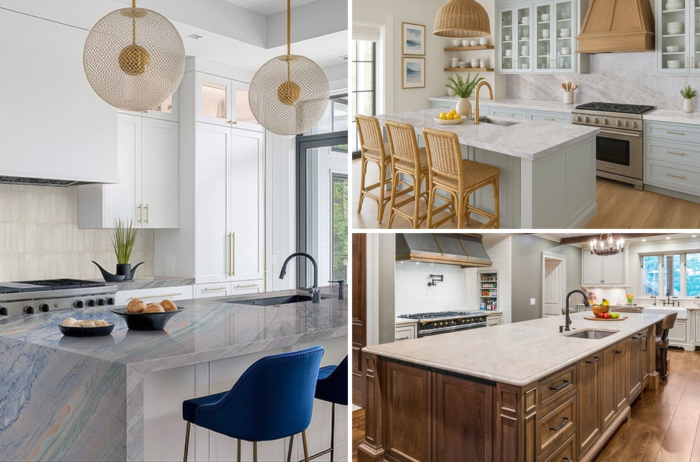
Natural Beauty With Limestone Look Quartz Countertops
One of the biggest trends in countertop design today is natural quartz countertops, and it’s no wonder! Our ...
Read MoreTwo Great Tools To Design Your Kitchen: Countertop Edge Visualizer And Kitchen Visualizer
Imagination is a wonderful thing, but it can only take you so far!When you look at samples ofcountertops, tiles,f ...
Read More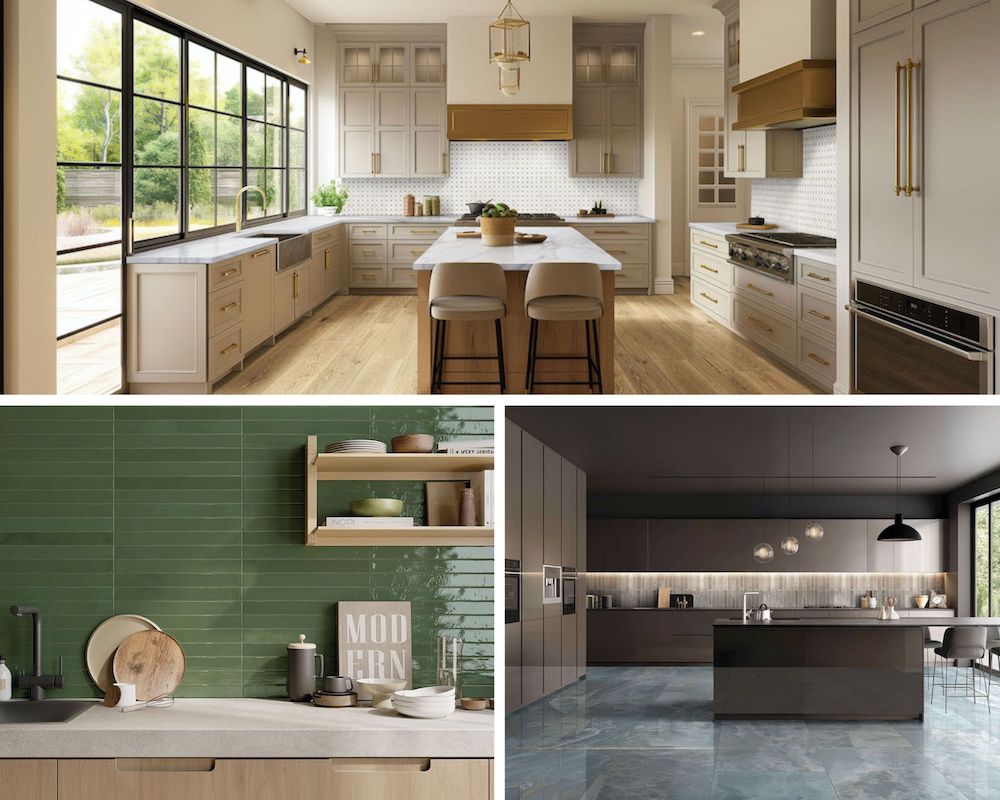
Countertops, Quartzite Countertops
Tips From The Trade: How To Clean Your Quartzite Countertops Quickly And Easily
Key Takeaways Quartzite countertops require a pH neutral sto ...
Read More
Countertops
Full Body Vs. Color Body Countertops: What's The Real Difference?
Key TakeawaysFull body surfaces feature general patterns and ...
Read More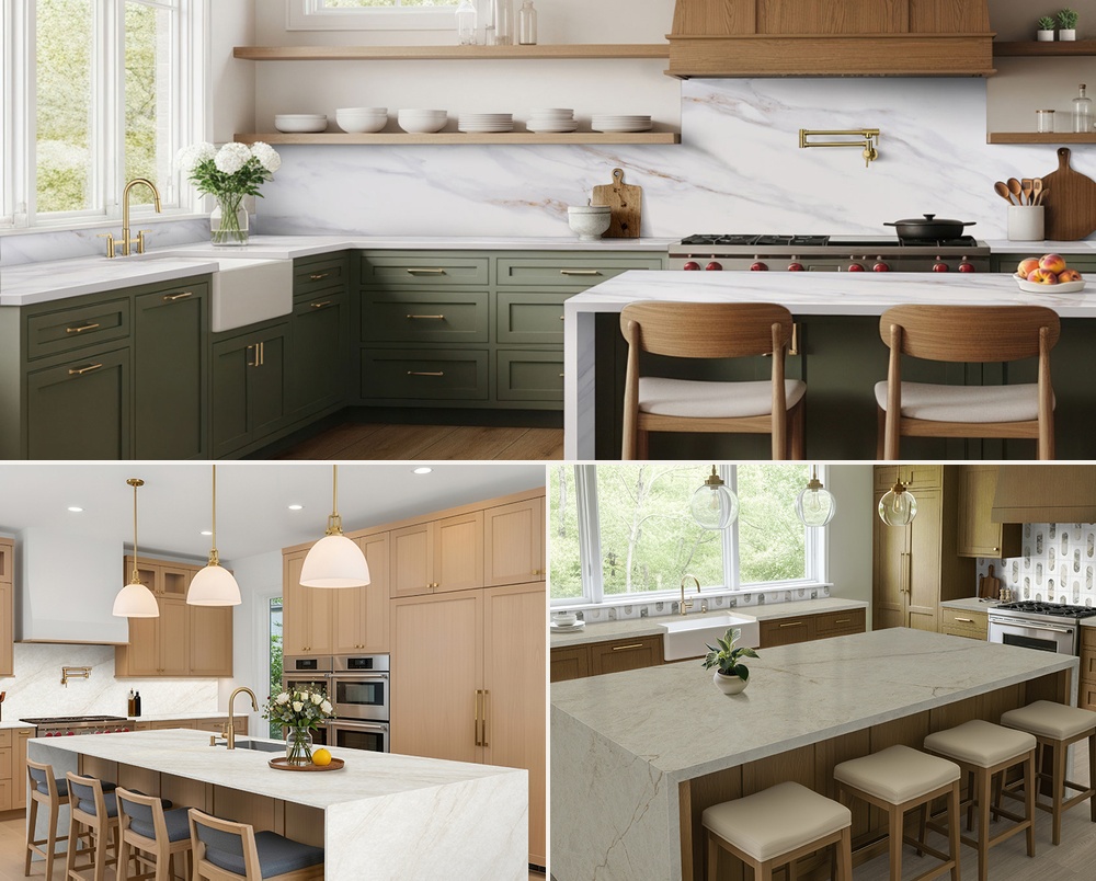
Natural Stone
Authentic Veining: How Engineered Stone Countertops Are Becoming More Realistic
Key TakeawaysModern manufacturing allows for multi-direction ...
Read More
#msisurfaces
POPULAR
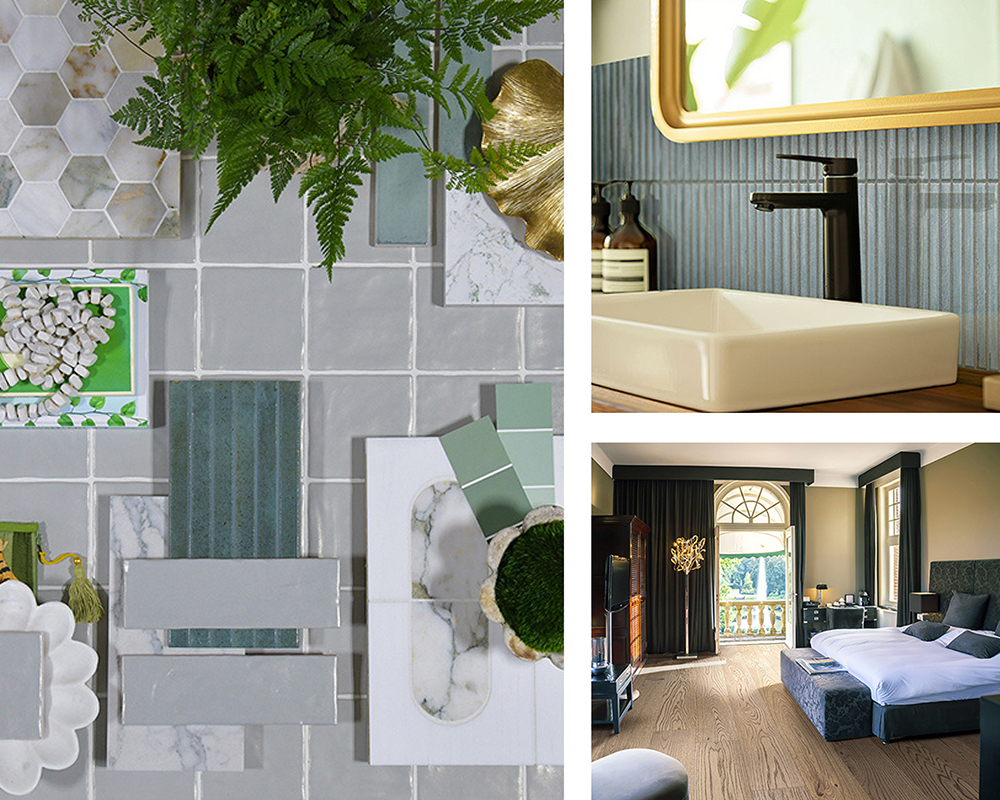
Exploring The Biophilia Trend: Designing With Nature-Inspired Materials
Biophilic design has become one of today’s most inspiring and impactful interior movements. With wellness a ...
Read More
Dream Kitchens

Trend Spotlight: White Marble Looks
Porcelain Pavers
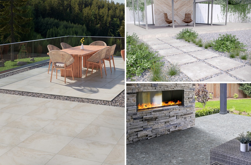
Forever Vibrant: The Fade-Resistant Benefits Of Porcelain Pavers Vs. Concrete
Key TakeawaysPorcelain offers superior UV resistance compare ...
Read More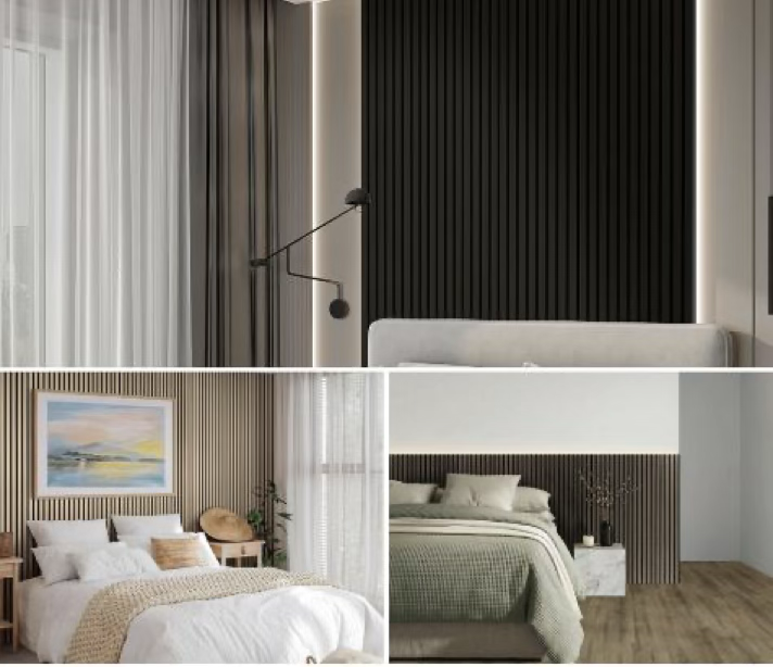
Wall Panels
DIY Design: Creating A Luxury Headboard With Acoustic Wood Slats
Key TakeawaysAcoustic wood slat panels establish a pronounce ...
Read More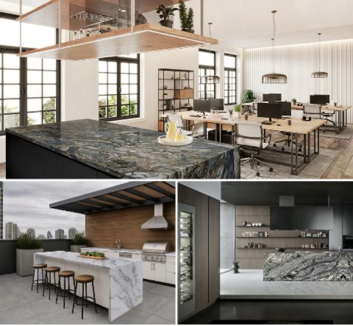
Quartz Countertops
Where Stone Flows: Quartzite Movement Meets Modern Luxury
Key TakeawaysQuartzite provides the durability of a hard-wor ...
Read More